Live cricket has become one of the most consumed digital experiences in the world, especially on mobile devices where most users follow matches in real time. In 2025, the focus is shifting beyond just speed and updates toward something more meaningful: accessibility-first design. This approach ensures that live cricket platforms are not only fast and informative but also usable for everyone, including users with disabilities, older audiences, and people using low-end devices.
What Accessibility-First Means in Live Cricket Apps
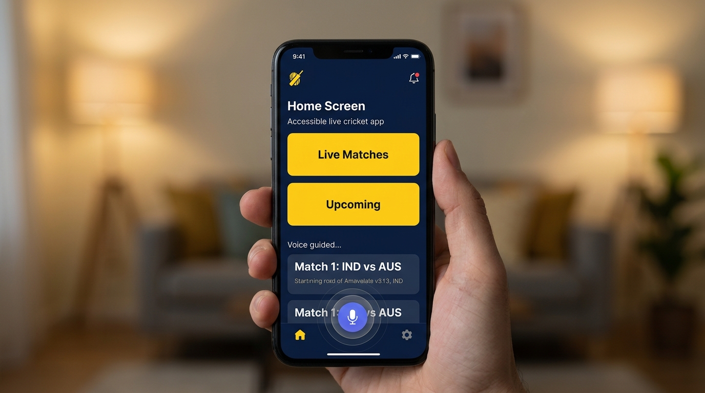
Accessibility-first design means building digital experiences that can be used easily by all types of users, regardless of their physical ability, device type, or internet quality. In live cricket apps, this involves clear layouts, readable fonts, voice support, and simple navigation.
Instead of overwhelming users with complex visuals and heavy graphics, accessibility-first platforms prioritize clarity, contrast, and simplicity. This ensures that match updates, scores, and commentary are easy to understand in real time.
Small-Screen UX and Mobile Optimization
Most cricket fans now follow matches on smartphones, making small-screen optimization extremely important. UX design for small screens focuses on clean interfaces, minimal clutter, and easy navigation.
Developers are designing cricket apps with vertical scrolling, collapsible scorecards, and simplified dashboards. This allows users to track live matches without confusion, even on smaller devices with limited display space.
Real-Time Updates with Low Data Consumption
Not all users have access to high-speed internet, so modern live cricket platforms are optimizing for low data usage. Instead of heavy video streams, apps now offer lightweight score updates, text commentary, and compressed graphics.
This ensures that users in rural or low-network areas can still follow live matches without interruptions. Accessibility is no longer just about design but also about performance efficiency.
Voice Assistance and Audio Commentary Features
Voice accessibility is becoming a major part of inclusive cricket experiences. Many platforms now offer audio commentary and voice-based match updates for visually impaired users or those who prefer hands-free interaction.
These features allow users to listen to ball-by-ball updates, match summaries, and key moments without needing to constantly look at the screen. This makes live cricket more inclusive and engaging.
High Contrast and Readable UI Design
Visual accessibility plays a key role in user experience. Modern cricket apps are adopting high-contrast themes, larger fonts, and color-blind friendly designs.
These improvements help users with visual impairments or reading difficulties follow live scores more easily. Clear separation between elements like scoreboards, player stats, and commentary improves overall readability.
Gesture-Based Navigation for Simplicity
Gesture-based controls are replacing complex menus in many live cricket apps. Users can swipe to switch between match stats, commentary, and scorecards.
This reduces dependency on buttons and makes navigation smoother for users of all ages. Simple gestures improve accessibility and create a more intuitive experience.
Inclusive Design for Global Audiences
Cricket has a massive global audience, and accessibility-first design ensures that users from different regions and backgrounds can enjoy the game equally.
Multi-language support, regional commentary options, and localized interfaces help make live cricket more inclusive. This ensures that language barriers do not prevent users from enjoying live updates.
Offline and Low-Bandwidth Modes
Some modern cricket platforms now offer offline or low-bandwidth modes where users can preload match data or receive simplified updates.
This feature is especially useful in areas with unstable internet connections, ensuring that users do not miss important match moments.
Role of AI in Accessibility Enhancements
Artificial intelligence is playing a major role in improving accessibility in live cricket platforms. AI can automatically generate summaries, highlight key moments, and provide personalized match updates.
It also helps adapt the interface based on user behavior, making the experience more comfortable and efficient over time.
Future of Accessible Live Cricket Experiences
The future of live cricket apps is moving toward fully inclusive digital experiences where accessibility is not an option but a standard.
With advancements in AI, voice technology, and adaptive UI systems, future platforms will be able to adjust automatically to user needs, ensuring that everyone can enjoy live cricket without barriers.
FAQs
What is accessibility-first design in live cricket apps
It means designing apps that are easy to use for all users including those with disabilities
Why is small-screen UX important in cricket apps
Because most users watch live cricket on smartphones
Do cricket apps support voice features
Yes many apps now offer audio commentary and voice assistance
How do apps help users with low internet speed
They provide lightweight updates and low data modes
Is live cricket becoming more inclusive
Yes modern apps focus on accessibility for all types of users
Conclusion
Accessibility-first live cricket platforms are transforming how fans experience the game on mobile devices. By focusing on small-screen usability, voice support, low-data performance, and inclusive design, these platforms ensure that live cricket is enjoyable for everyone, regardless of device, location, or ability.